Ministry Basics: Good, Quality Signage

Good signage in a must-have in kidmin.  Not only does good, quality signage add a touch of decor to your space but it also helps families navigate their way through your ministry area.

Last summer, our ministry had new logos designed (one for each of our 4 ministry areas) and those logos were a part of new signage for our entire Children’s Ministry space.

Here are a few of the signs that were added to our space:

Our ministry has two entryways; this is the sign above one of them
Nursery entrance sign
One of my favorite walls - leads to our Preschool area
One of my favorite walls – leads to our Preschool area
Pre-K room sign
Pre-K room sign
Across the hall from our Preschool classrooms is a corresponding wall sign
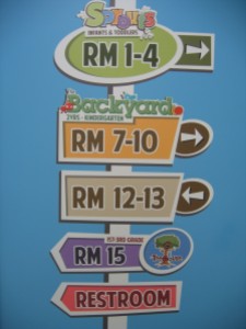
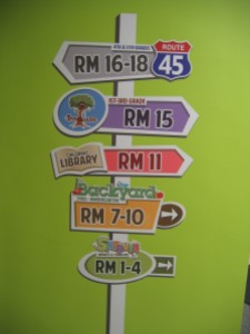
One of our directional signs
Another directional sign
Children's Library sign
Children’s Library sign
Sign above our Elementary Ministry entrance
Directional sign to our Preteen Ministry area

If you look closely, you’ll see that we were not afraid to use bright, kid-friendly colors on the walls.  We’ll save the story behind that for another post.

In the meantime…How do you use signage in your kidmin?  Share below – pictures are welcome!